Kharakter Festival
Brand Strategy & Identity System | 2025
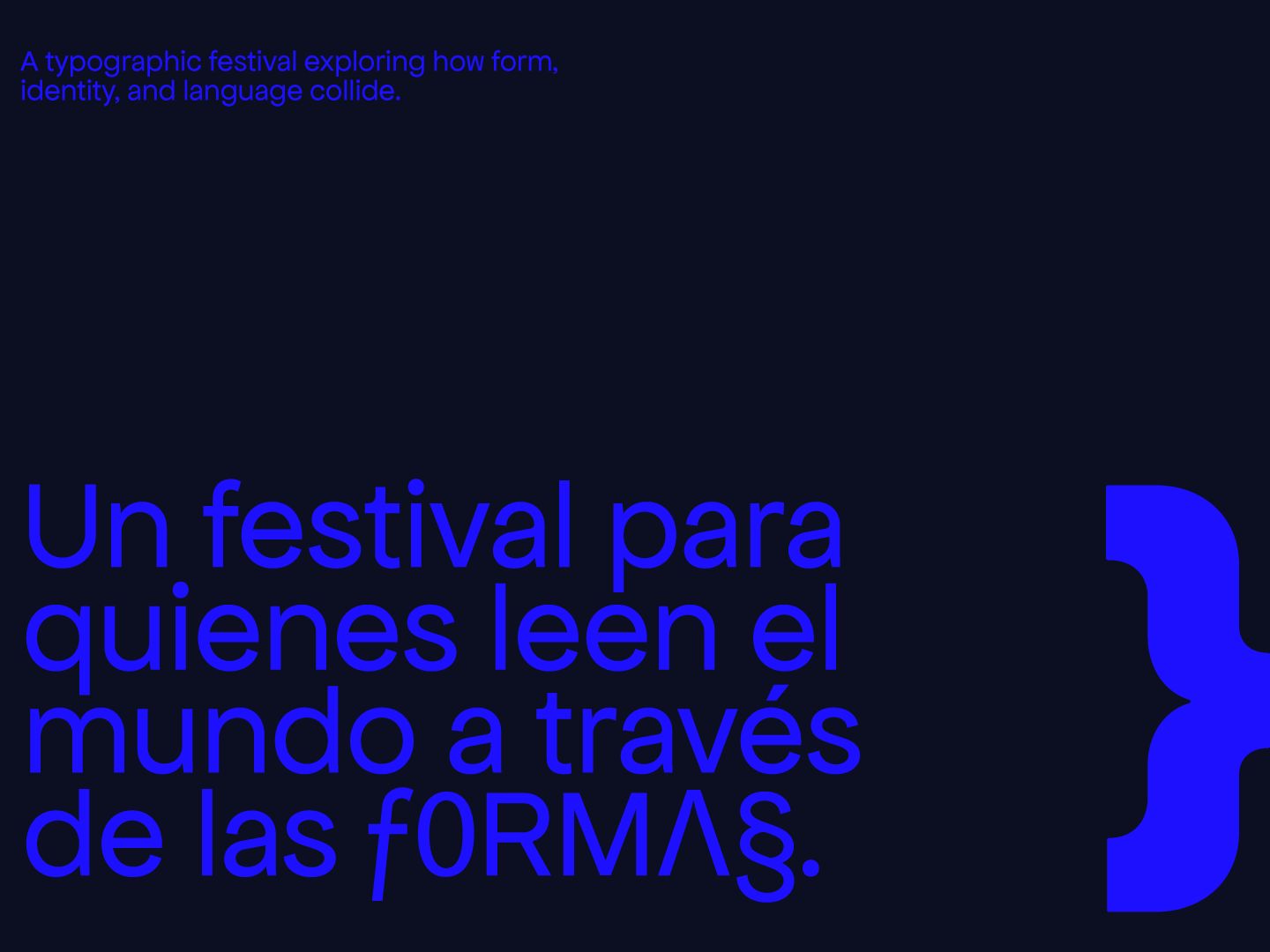
Can typography carry the full weight of a brand identity, without illustration, without photography, just letterform as structure and gesture?
kharakter is a typographic festival identity built to explore that question. I led the creative direction, naming, brand strategy, and visual system, designing an identity grounded in visual perception, modular systems, and the expressive power of type.
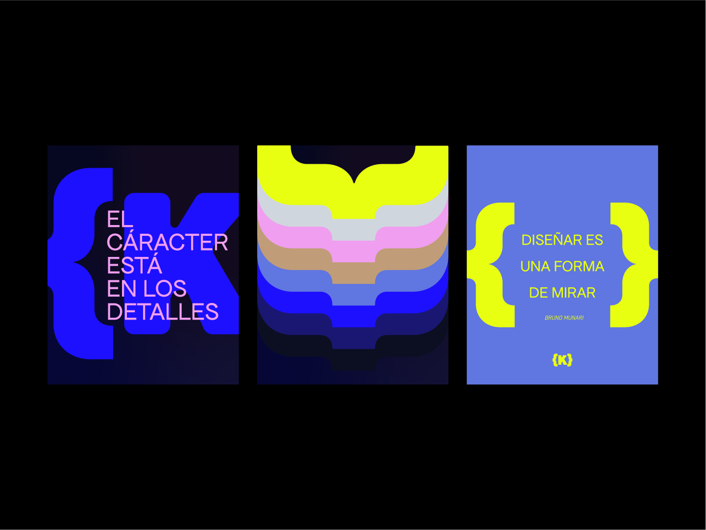
The project investigates how form, language, and identity intersect. Rather than treating typography as a supporting graphic element, the identity positions it as the primary carrier of meaning, a medium capable of expressing tension, rhythm, and character through structure alone.
The project investigates how form, language, and identity intersect. Rather than treating typography as a supporting graphic element, the identity positions it as the primary carrier of meaning, a medium capable of expressing tension, rhythm, and character through structure alone.
Naming
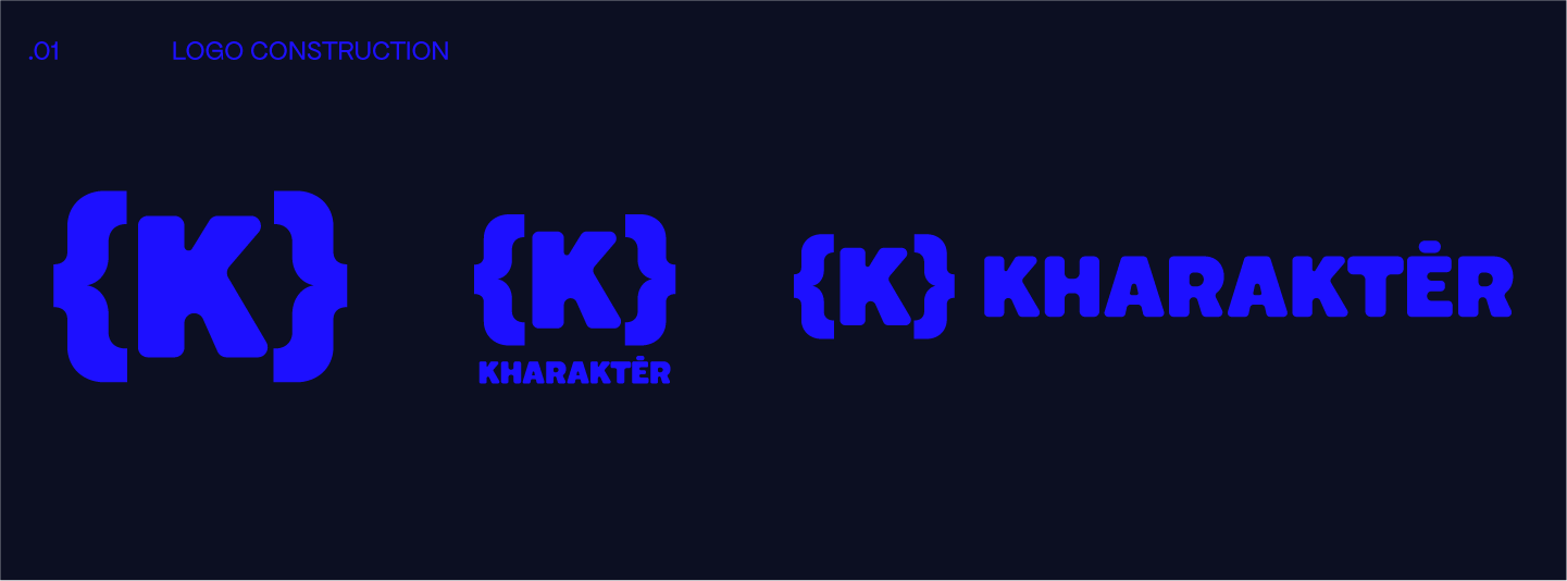
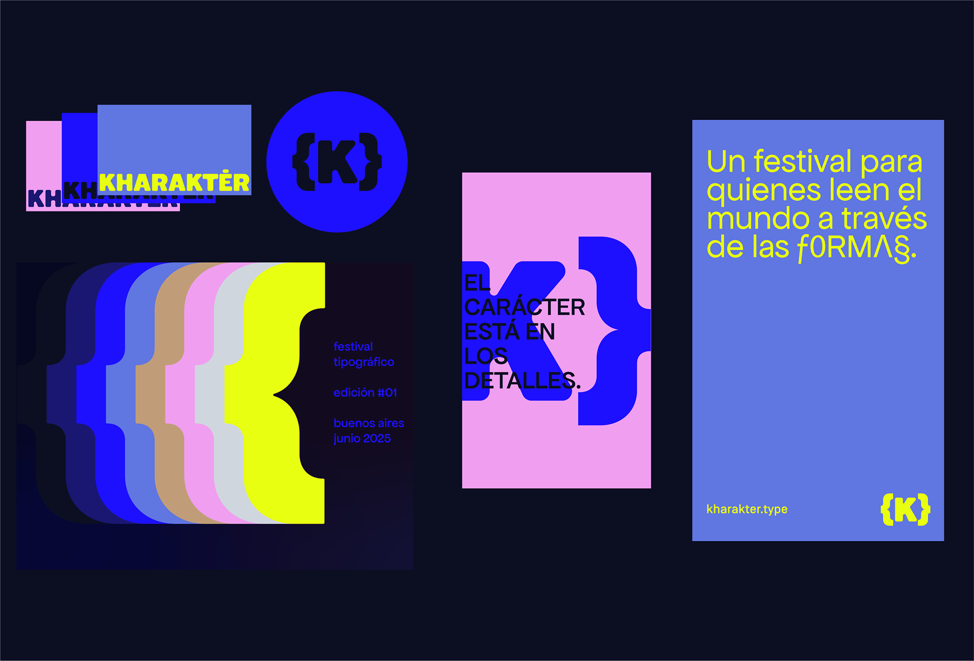
The name kharakter draws from the Greek root for “engraved mark”, the idea that every letterform carries an imprint, a gesture, a trace of intent. The naming, strategy, and visual system were developed together as a single integrated process, each decision informing the next.
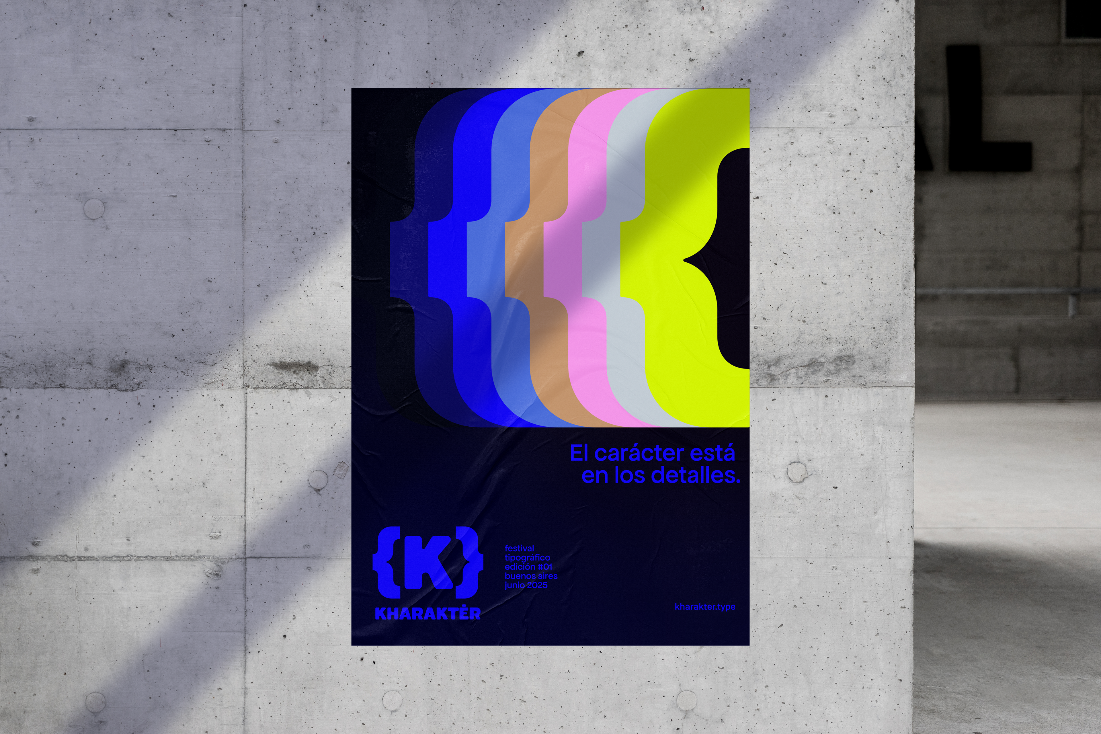
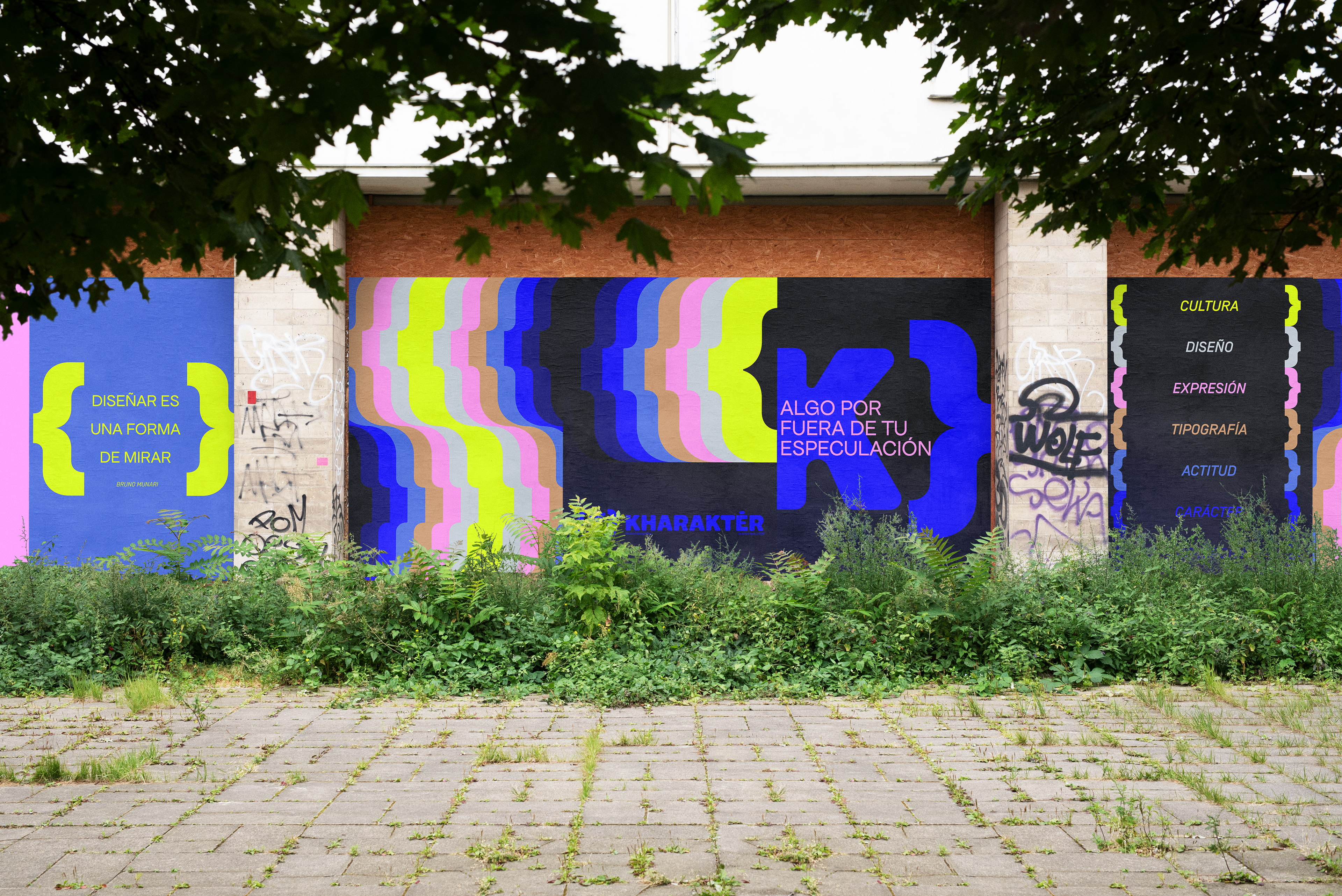
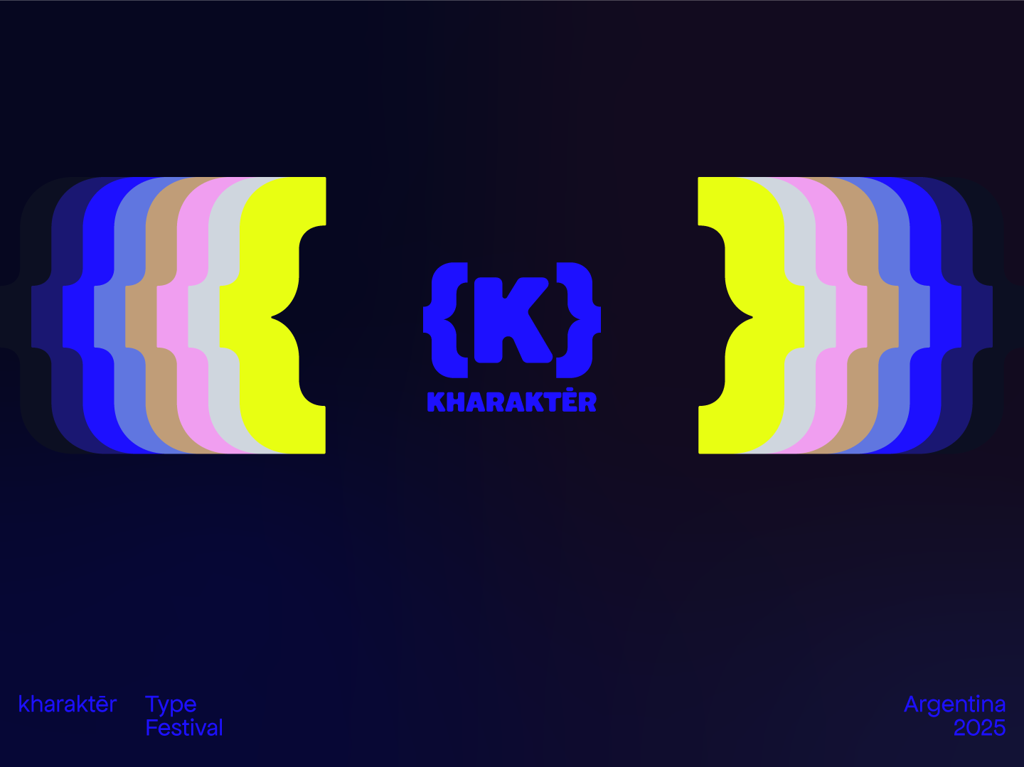
The System
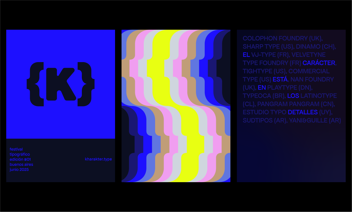
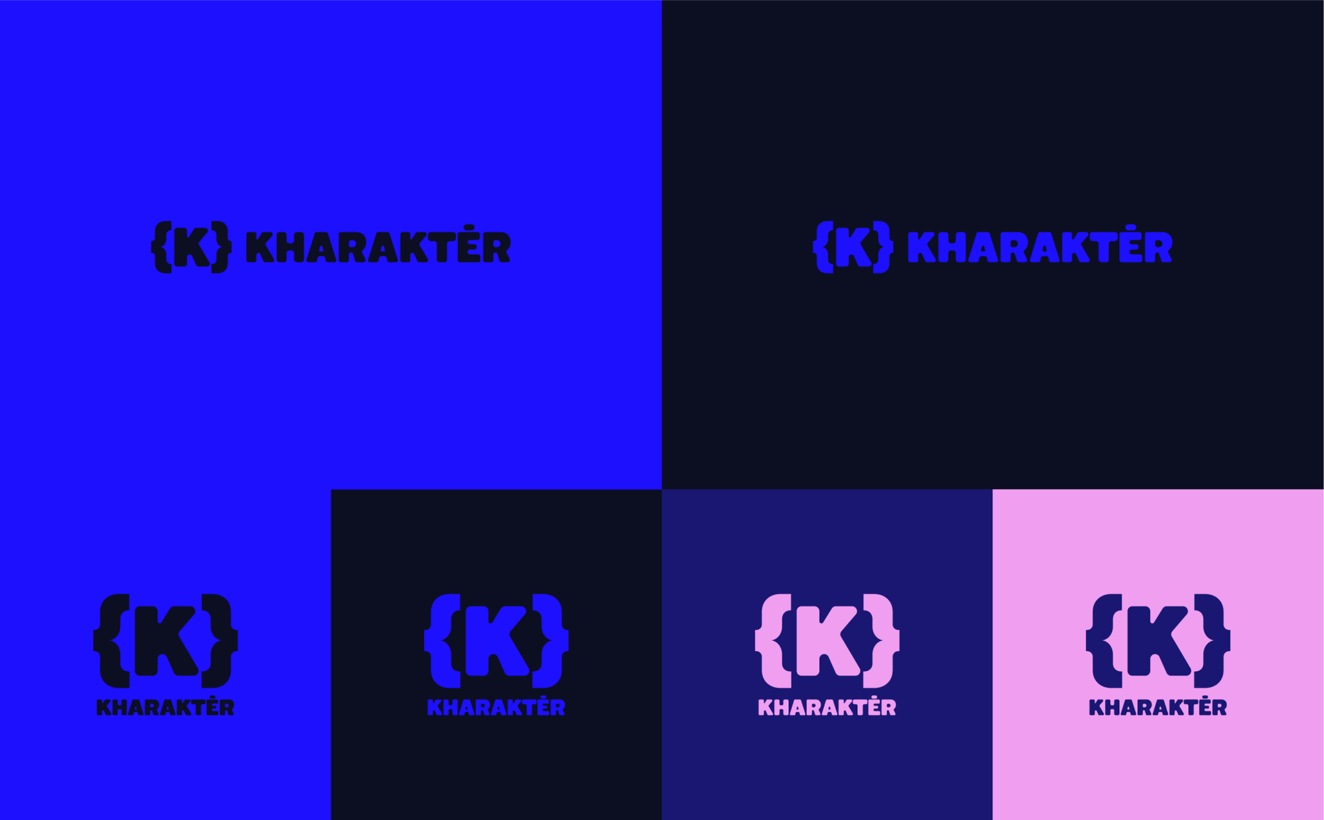
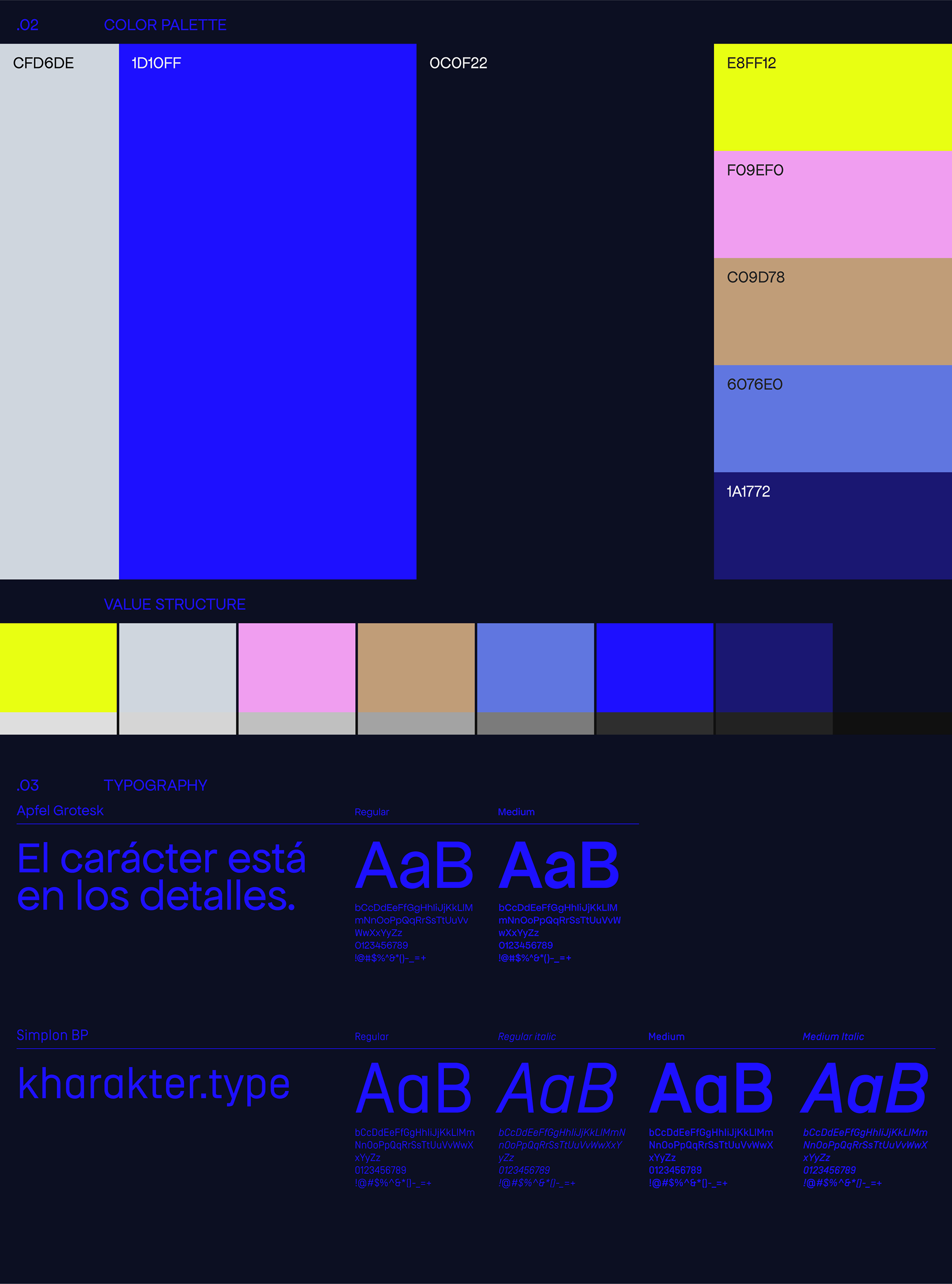
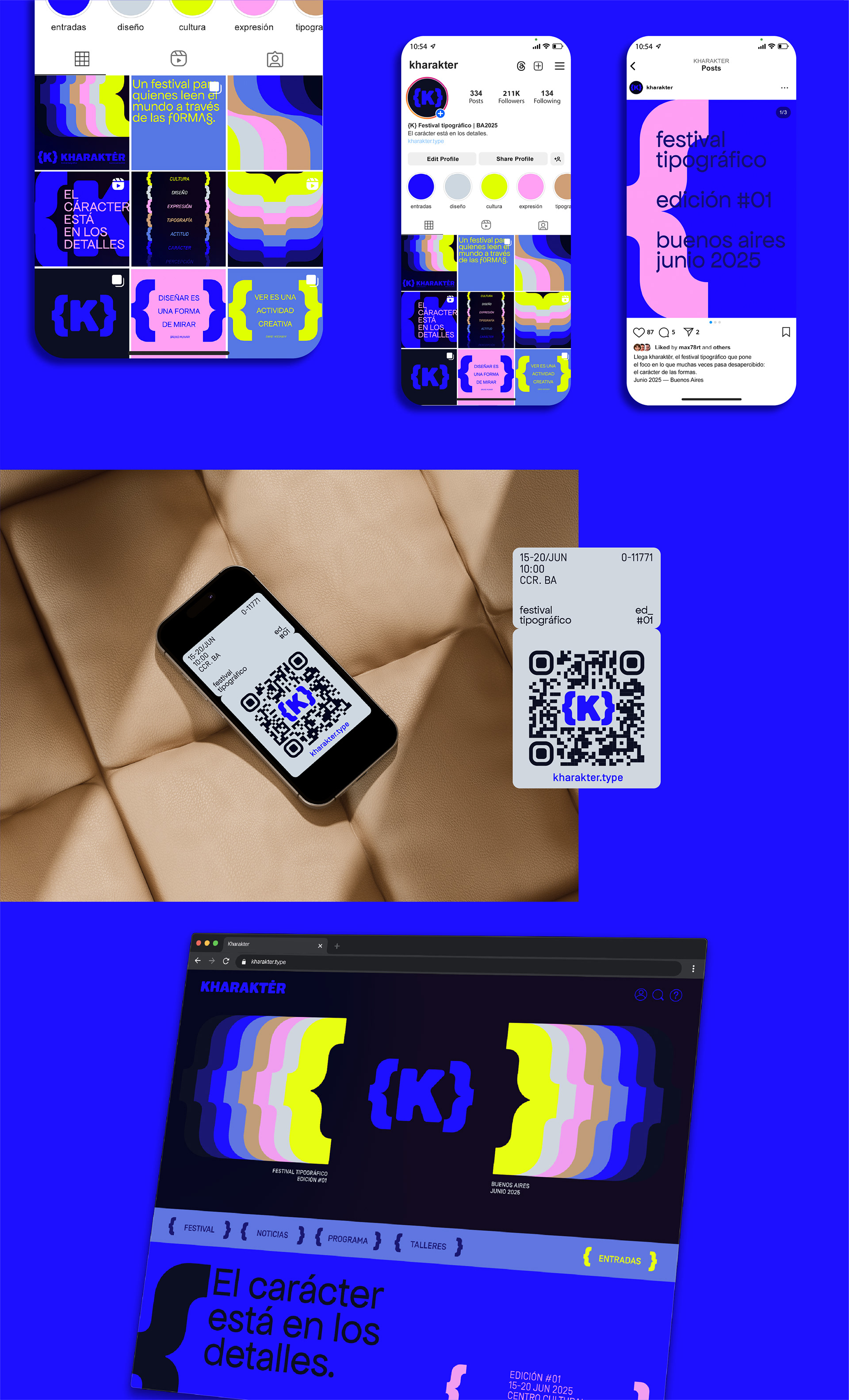
The visual system is built on modularity and typographic power, a flexible framework that adapts across scales and formats while maintaining a cohesive identity. Every element, from the grid to the color language, reinforces the central idea: typography is not decoration. It’s architecture.
Credits
Creative Direction, Naming, Strategy & Visual System: Manuel Freixas
Developed as the Final Project of the Master's in Art Direction, LABASAD (Barcelona)