For 36 Days of Type at Raxo, we designed letters in the styles of our favorite artists. I chose Ricardo Bofill for "B" and Emilio Pettoruti's cubist works for "P".
Check out some of the process behind these designs below!"B" inspired by Ricardo Bofill
Chosing this artist was a real challenge. His work, especially "La Muralla Roja", is such a beautiful and inspirational construction, it has served as source of reference for lots of 3D artists. Moreover, it was difficult for me as I hadn't used 3D software in quite some time.
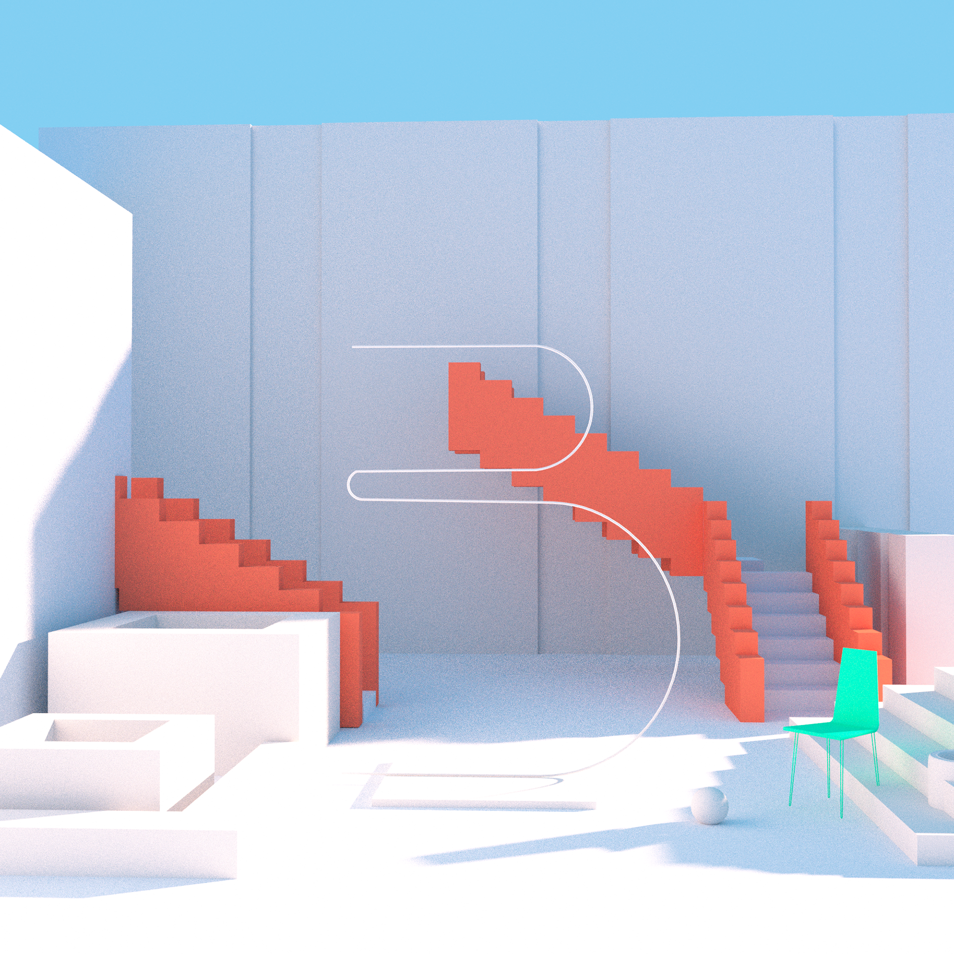
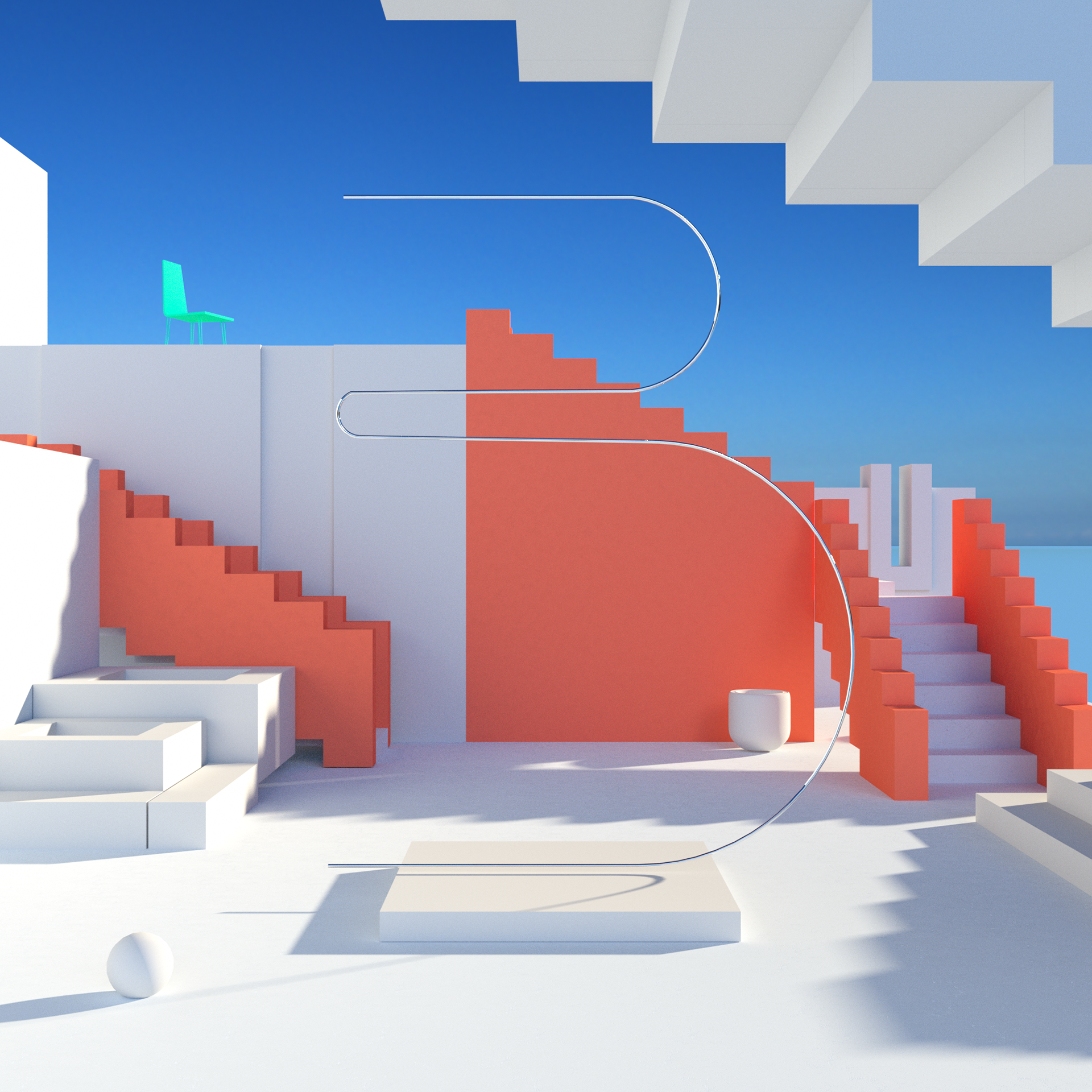
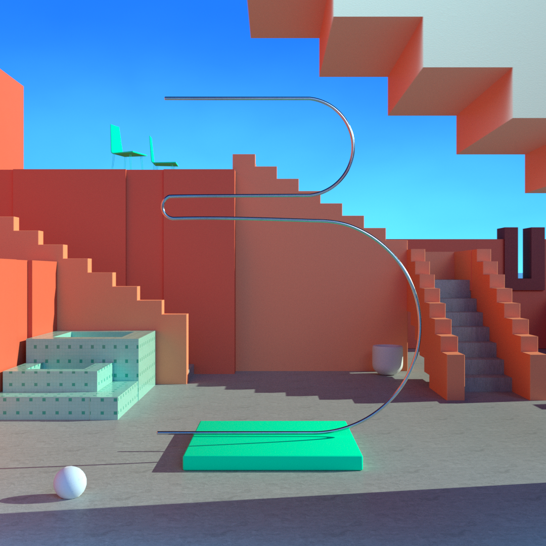
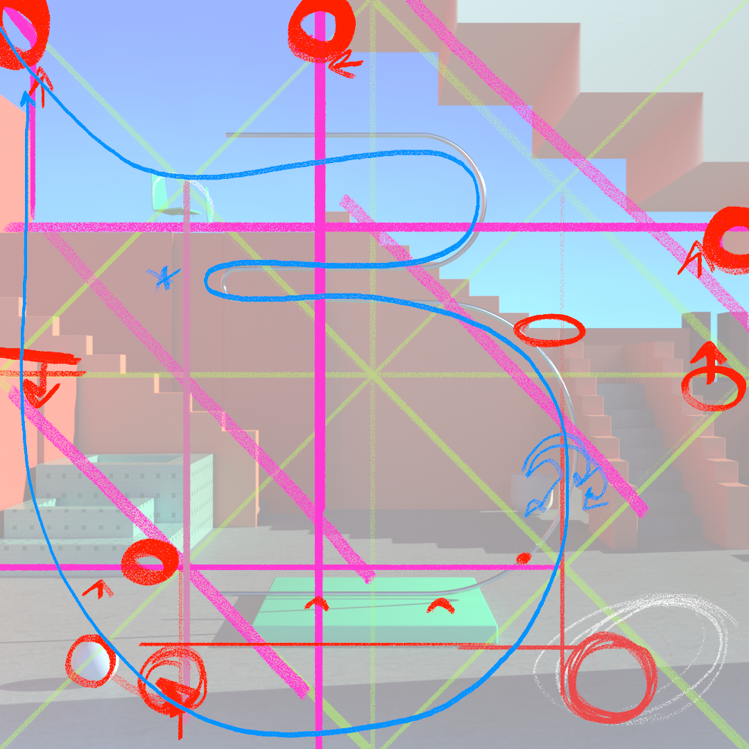
Some reference pictures of Ricardo Bofill's work, and my process in 3D, from early blocking stages to lighting and shading.
"P" inspired by Emilio Pettoruti
After working with 3D I really wanted to move into painting. I always loved this artist, so this seemed like the perfect excuse to pay homage to him and also get back to Photoshop.
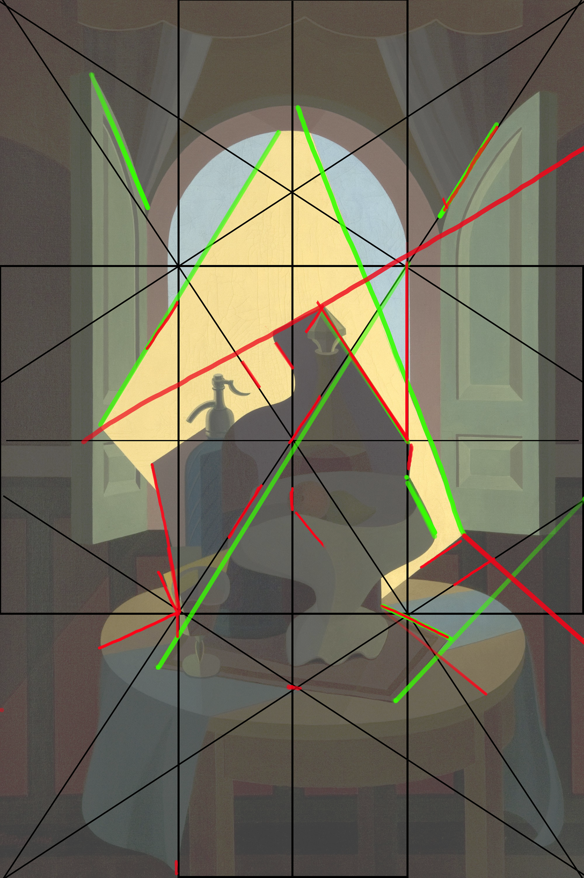
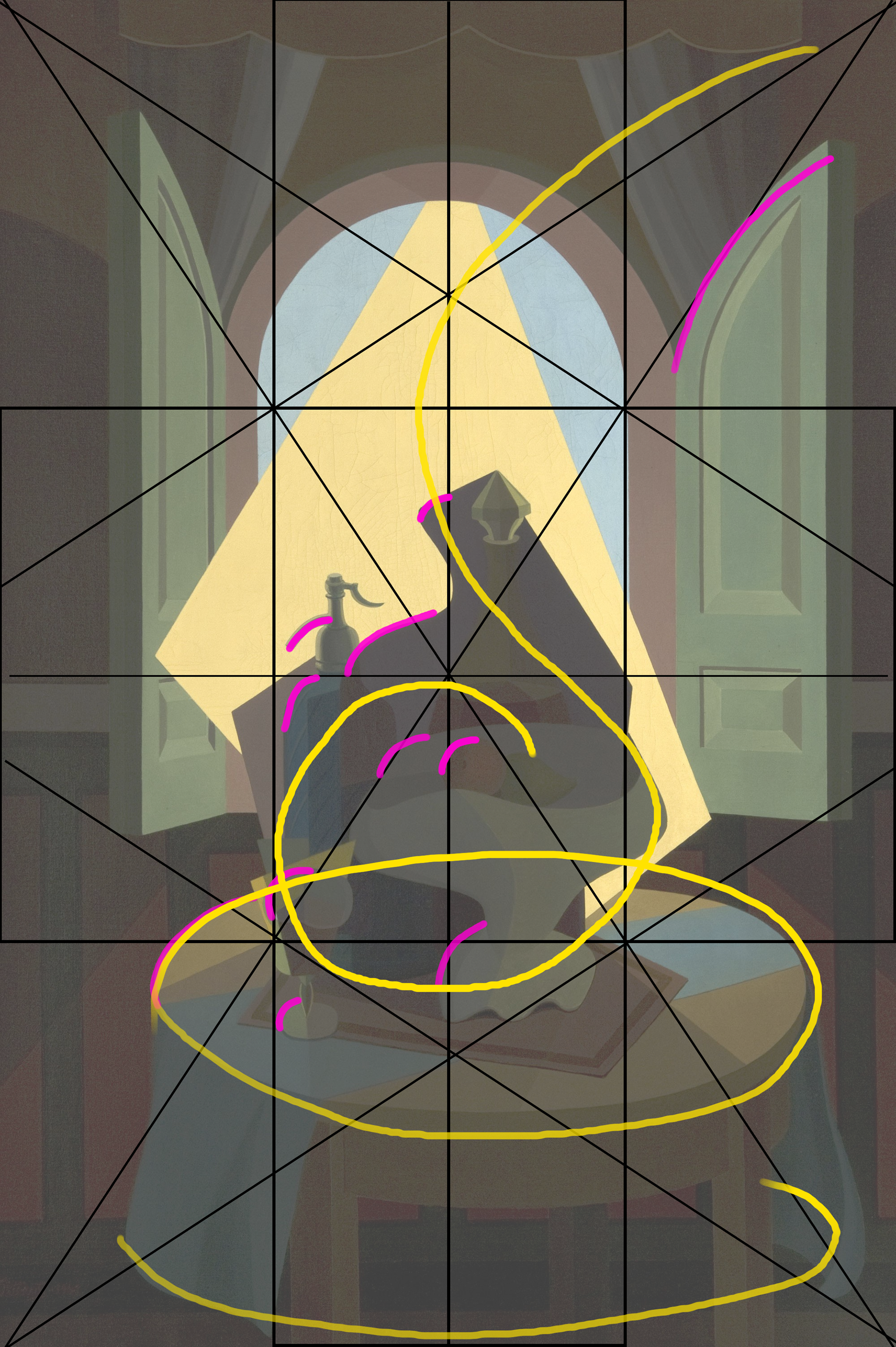
I studied one of Pettoruti's paintings of the series "Soles argentinos" to try and figure out the hidden structure he worked with. Coincidences, diagonals, arabesques and masses of color where some of the resources he masterfully used.
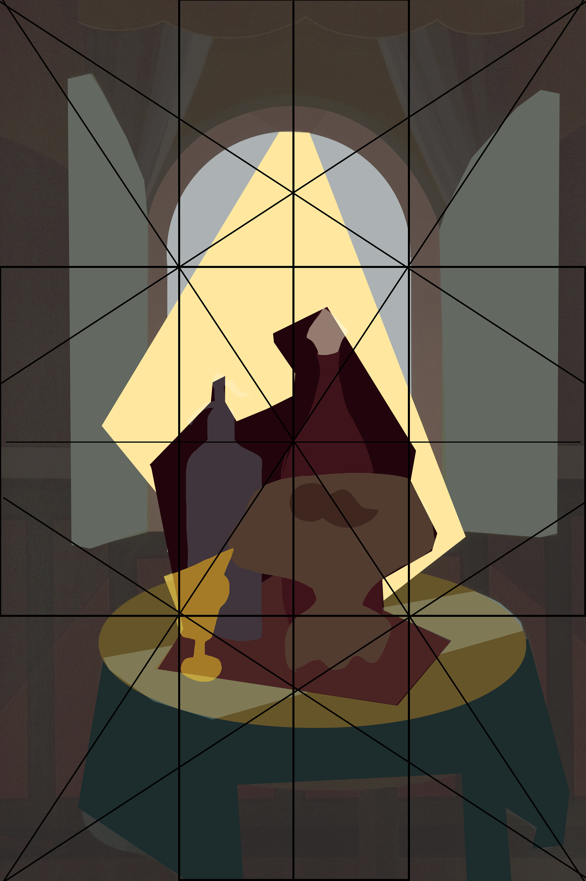
The first sketch I started with. I had it clear from the beggining I wanted to use a guitar as the "P"... I always got a cubist feel from this instrument.
This is the final result.

